Introduction
One of the first things to always keep in mind is “weather is like the humidity, it’s all relative”. In most aspects of weather, observed values of pressure and temperature are not as important as the change in pressure or the change in temperature. In meteorology, we refer to the “change in” as a gradient.
Any time there is a rapid “change in” any particular weather element we will say the “gradient” is large. It is near these large gradients where the weather is most active.
A common example is found near cold fronts. The “change in” air pressure is typically rapid near a cold front and therefore the pressure “gradient” is large. The greater the pressure gradient is near a front the stronger the wind. This is just as true for the upper atmosphere.
While the information a skew-t chart provides is invaluable, it will only tell us what is happening in the atmosphere at that location. To paint a complete picture of the atmosphere as a whole we need to view radiosonde data from many upper air observations.
We do this by creating constant pressure charts that let us see changes, and gradients, in atmospheric conditions across the country and around the world.
Constant Pressure vs. Constant Elevation
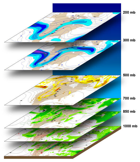 Both at the surface and in the upper atmosphere, meteorologist constantly refer to “high” and “low” pressure systems. However, we look at them from two different perspectives.
At ground level, we seek air pressure values as they relate to “sea level” which provides us with a picture of the weather patterns at the surface. Using sea level (elevation = zero) as the common baseline we are able to make meaning of different pressure values between stations. So, on all surface charts, the elevation of the “surface” is considered zero feet.
The lines drawn on surface charts connecting areas of equal pressure are called isobars. “Iso” means equal and “bar” is the unit by which we measure pressure. Therefore, an isobar is a line representing the location where the pressure is equal (the same) along that line.
When we examine the atmosphere however the altitude at which any particular pressure value occurs will vary from reporting station to reporting station.
These changes in altitude represent different air densities in the atmosphere. Recall that as air temperature decreases the air’s density increases.
This means the altitude where any particular pressure occurs will be lower in the atmosphere when the air is colder. Conversely, higher air temperatures result in lower densities which increases the altitude of pressure levels.
This is why, as a rule, the atmosphere decreases in height from the equator toward the poles.
Therefore, we draw lines on constant pressure chart to represent the altitude at which that particular pressure occurred. These lines are called isoheights, lines of equal height.
By convention meteorologists simply refer to isoheight lines as ‘contours’. These lines are analogous to topographic charts. In essence, upper air charts show the atmosphere in three dimensions.
By looking at these contours we observe patterns of higher heights (called ridges) and lower heights (called troughs). These ridges and troughs drive the weather we experience at the surface.